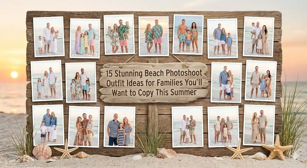
Let’s be honest: picking family portrait outfits feels way harder than it should. You want everyone to look good, but not too matchy-matchy. You want the colors to be flattering, but not boring. And of course, you definitely don’t want to look back at these photos in five years and think, “Why did we dress like a discount boy band?” I’ve been there more than once — trust me.
So in the spirit of saving you from outfit meltdown mode, I put together 15 family portrait outfit ideas that always look beautiful and natural, no matter where you take your photos or who is in them. Think of this as friendly advice from someone who has done the frantic “What is everyone wearing??” group message scramble more times than I’d like to admit.
I’ll keep this simple, realistic, and full of helpful tips that actually work in real life (yes, even when toddlers refuse pants). Ready? Let’s make these photos amazing.
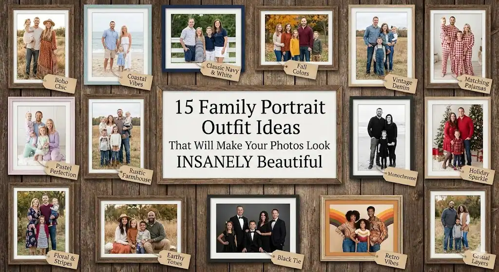
1. Soft Neutral Tones (A Go-To Classic)
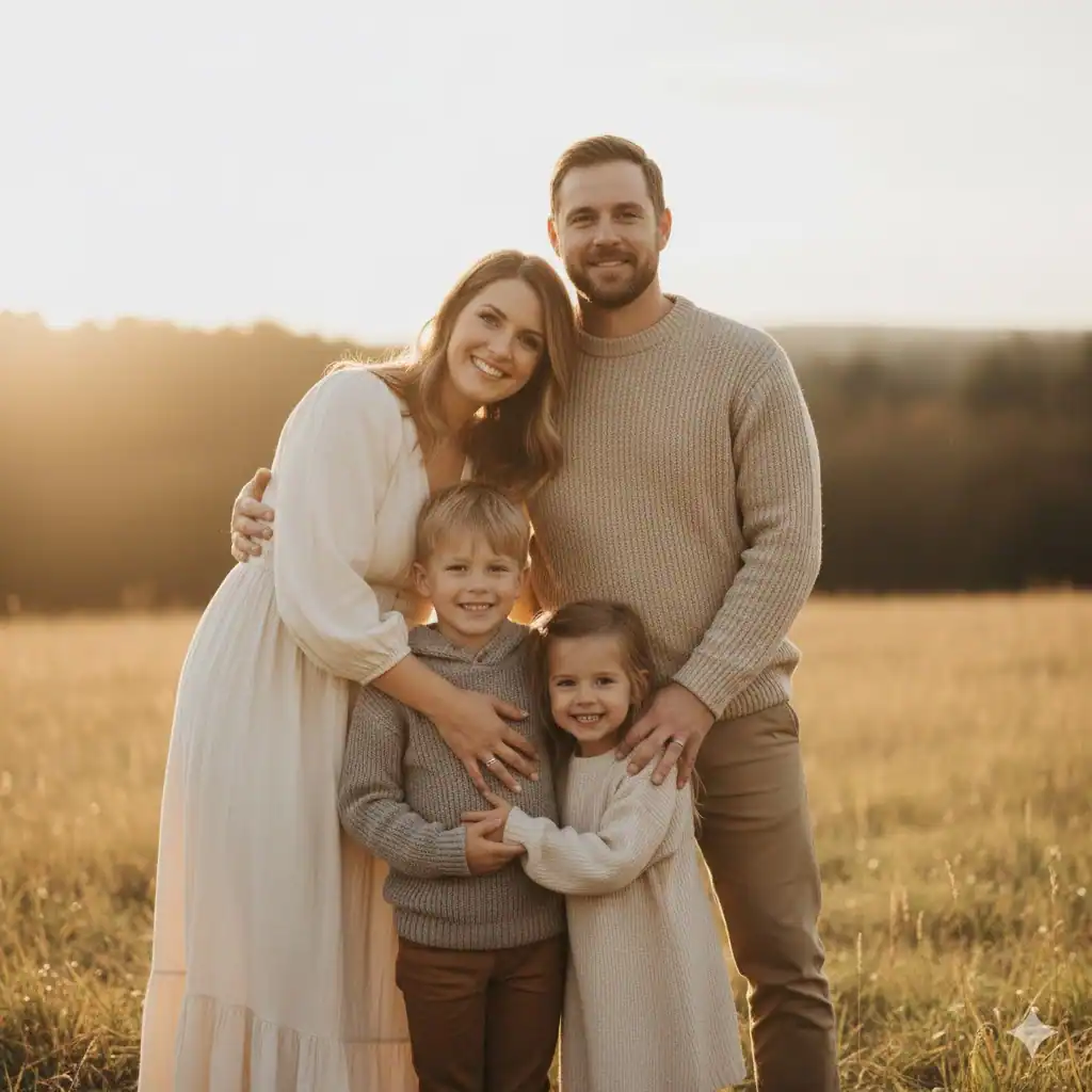
Whenever you feel overwhelmed, go neutral. Soft tones like cream, beige, tan, gray, muted greens, and soft browns always look elegant and timeless in photos. I’ve seen families of every shape and size pull this off beautifully, and the best part? You don’t need to overthink anything.
Neutrals create a calm, cohesive aesthetic that puts the focus where it belongs: on your faces and your connection. You also don’t have to worry about clashing patterns or bright tones stealing attention. If you’ve ever wondered why so many Pinterest-perfect family portraits look effortless, this is why.
Try this:
- Mom: Flowy cream dress
- Dad: Light tan chinos + white/grey henley
- Kids: Mix of browns, gray, and off-white knits
Why it works: Every tone belongs to the same soft, earthy color family.
Ever noticed how neutrals never go out of style? There’s a reason.
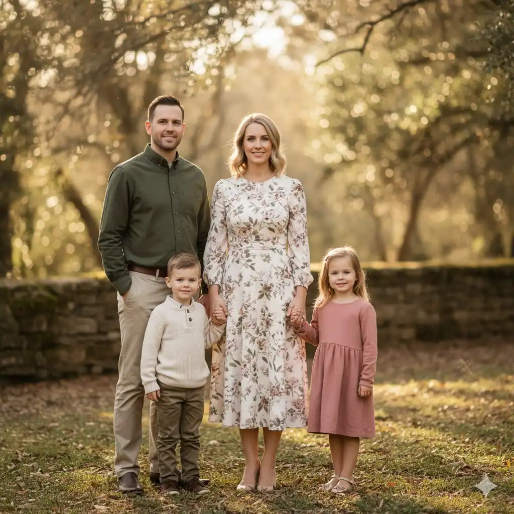
2. Coordinated, Not Matching
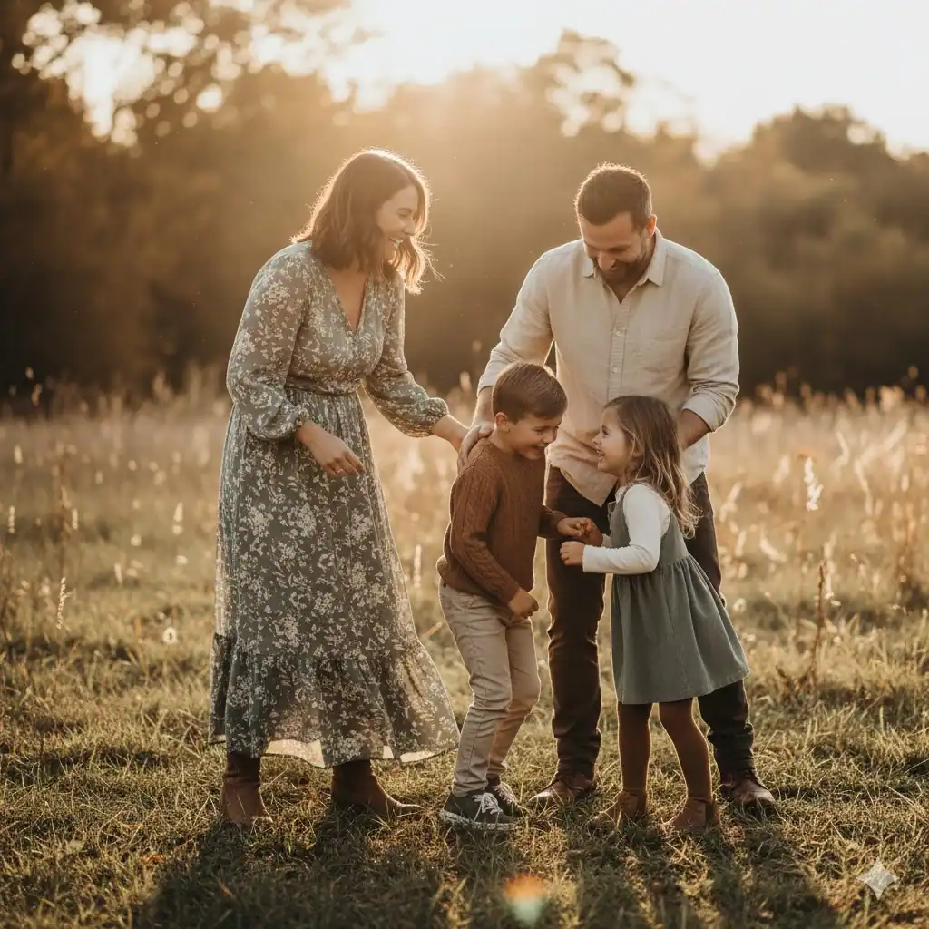
The era of everyone wearing the same white T-shirt and jeans is over (thankfully). Today, the key is coordinating color palettes instead of matching identical outfits. This gives your portraits depth, texture, and a more natural vibe.
Think of the outfits like they’re part of one color story — each person wears something different, but the pieces complement each other. This creates visual interest without looking chaotic.
Here’s a helpful formula:
- Choose 2–3 main colors
- Add 1–2 neutral base colors
- Make sure every outfit includes one of these tones
This gives consistency without feeling forced.
Ask yourself: “Does everyone belong together visually?” If the answer is yes, you’re set.
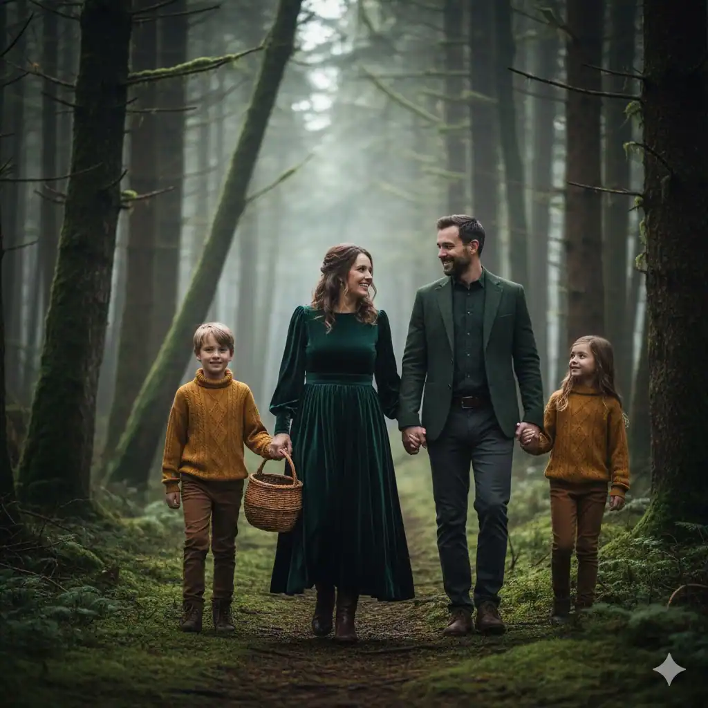
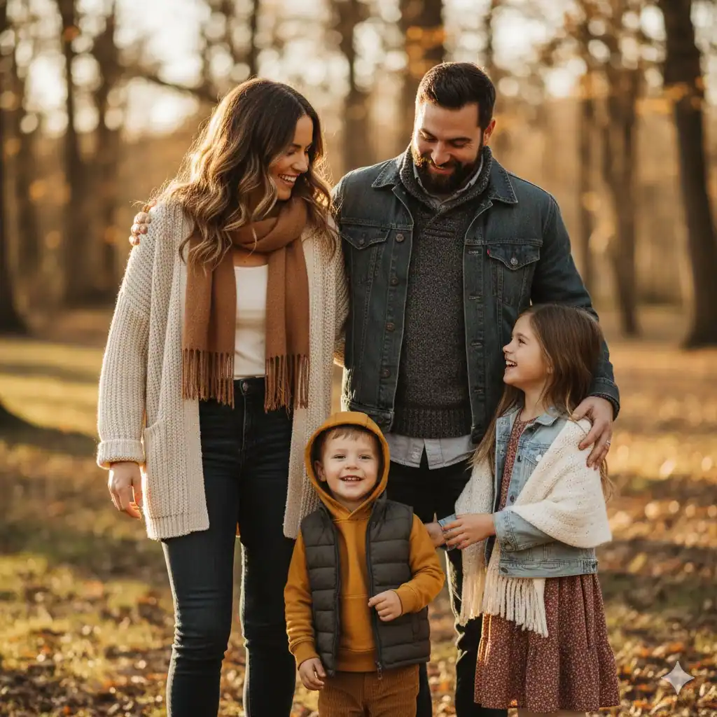
3. Earthy Autumn Palette
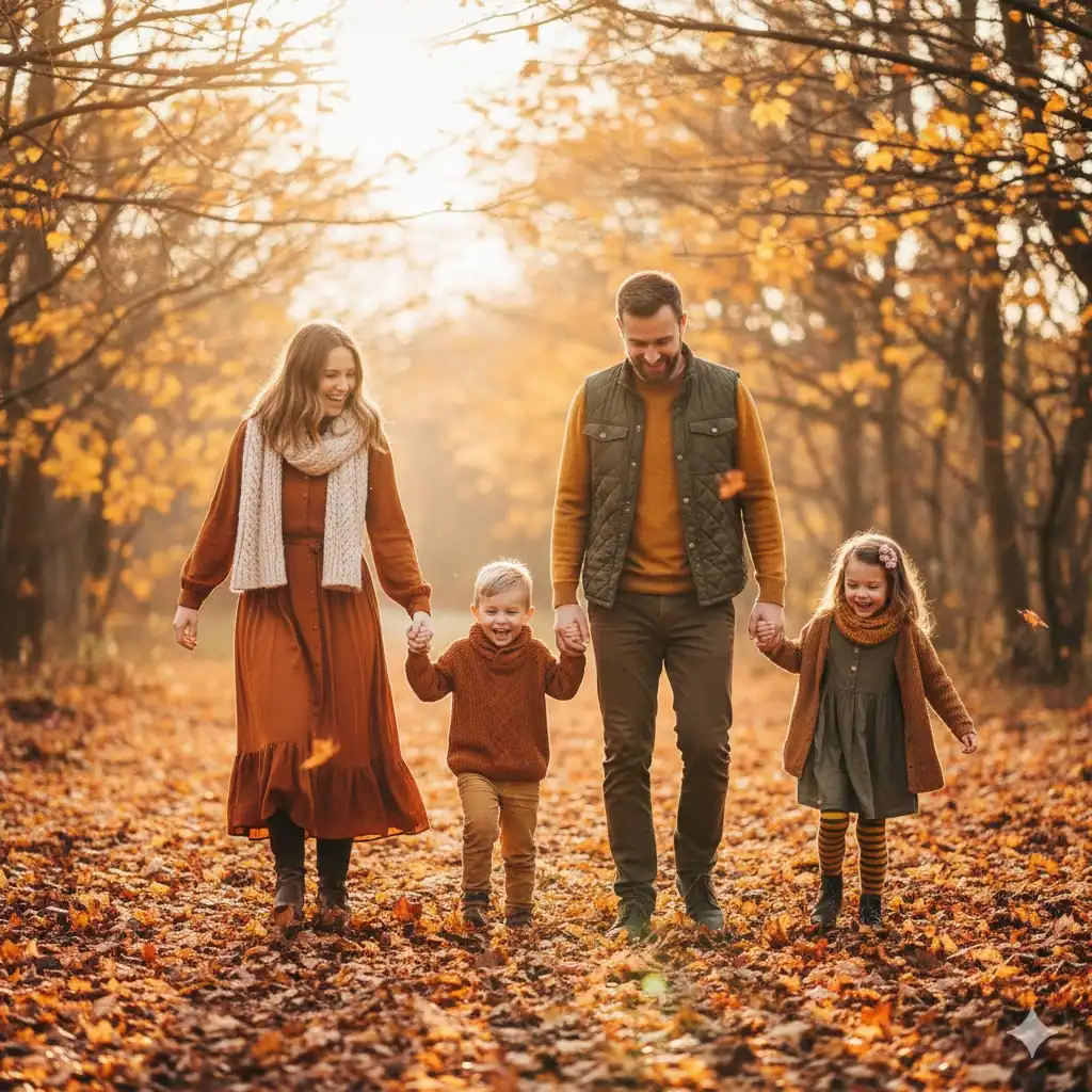
If your photos fall in the fall season (pun very much intended), earth tones are your best friend. Think rust, olive, deep mustard, warm browns, and burnt orange. These colors look incredible against autumn leaves, pumpkin patches, forest trails, or open fields.
I once photographed a family that dressed in sage, terracotta, and golden brown — and wow, the warmth in those photos looked unreal. The colors blended with nature, yet each person still stood out beautifully.
Bonus tip:
- Add layers — scarves, jackets, and cardigans add visual depth.
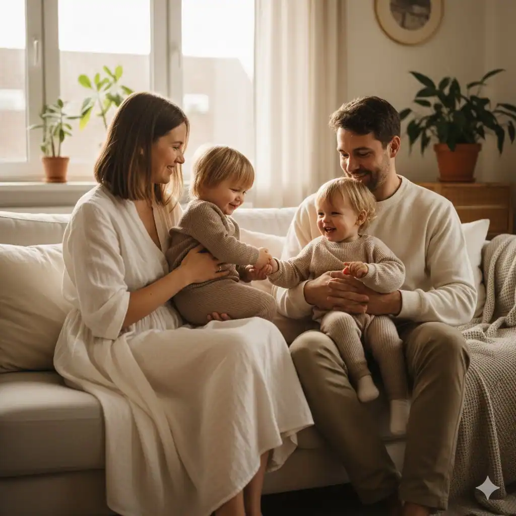
4. Denim + Soft Knits for a Cozy Look
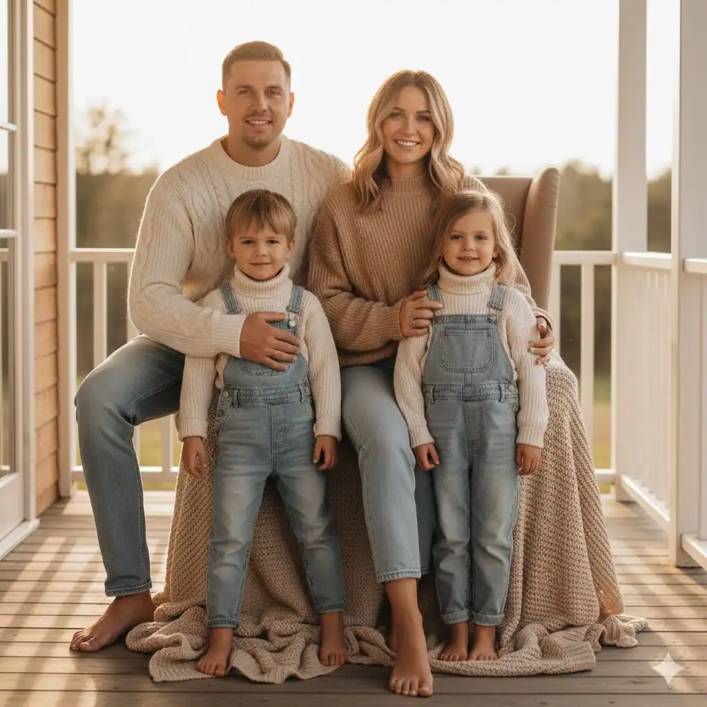
If you want something casual and easy to put together, try light denim paired with cream or tan knits. This style looks clean, relaxed, and effortlessly pulled together. It also feels comfortable, so no one looks stiff or miserable — which, let’s be honest, helps a lot.
Example:
- Kids in denim overalls + knit sweaters
- Parents in jeans + cream sweaters
- Baby in a soft knit romper (very cute vibes) 🙂
This look works especially well for at-home or outdoor lifestyle photos.
5. Light Pastels for a Soft, Airy Look
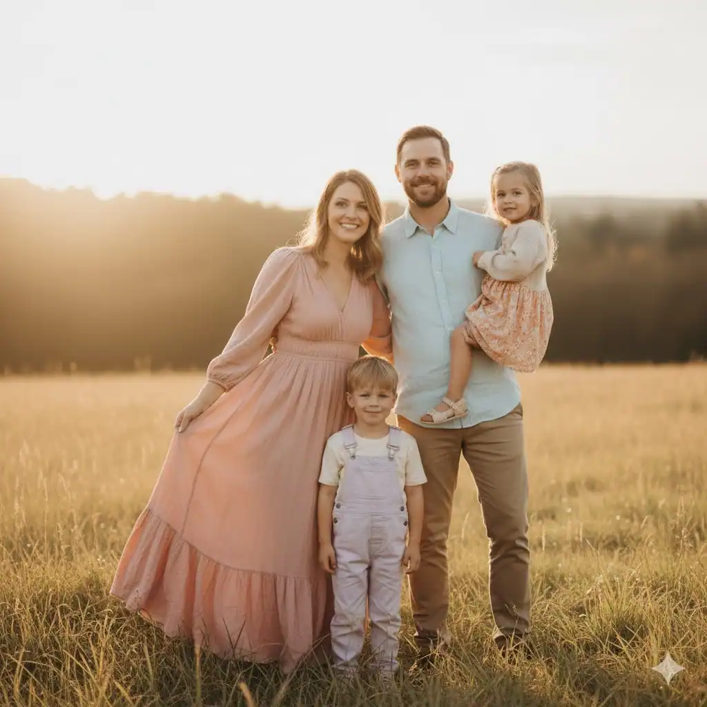
If you want your photos to feel dreamy, peaceful, and light-filled, pastels are the way to go. Soft pinks, baby blues, lavender, and dusty peach look gentle and romantic in family portraits.
This palette works especially well for springtime or beachy photos because the colors reflect light beautifully. And don’t worry — wearing pastels doesn’t mean you all look like an Easter basket. When used thoughtfully, the tones stay subtle and calm.
Pro tip: Balance pastels with whites or light grays to anchor the look.
6. A Touch of Pattern (But Just One Key Pattern)
Patterns can totally elevate your outfits — if used wisely. The best rule? Only one person should wear a bold pattern, and the rest of the family should wear solid colors that pick up tones from that pattern.
For example: If mom wears a floral dress, everyone else can wear outfits that match the colors in the floral design. This ties the group together beautifully without making the photo look loud or busy.
Ask yourself: “Does this pattern support the group look or distract from it?” If it distracts, scale it back.
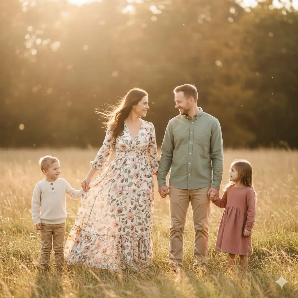
7. Beach Family Portrait Outfits
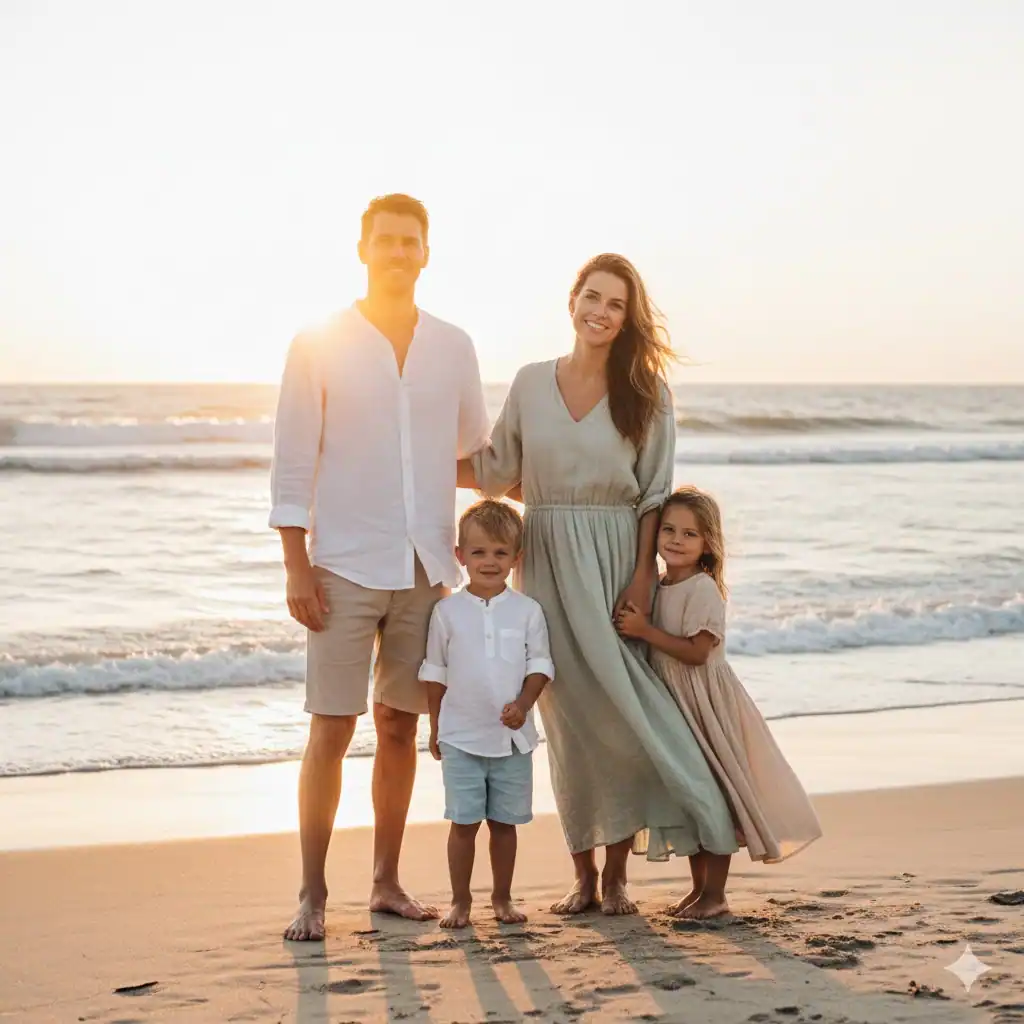
Beach portraits call for light, flowing, breathable outfits that move with the wind and reflect light softly. Nothing looks better than muted blues, whites, sandy beiges, and soft sage greens when taken by the water.
Try this look:
- Mom: Flowy white or pastel dress
- Dad: White linen shirt + light tan or gray shorts
- Kids: Overalls, button-ups, or dresses in the same palette
Bare feet encouraged. Wind-approved outfits? Even better.
8. The “All White, But Tasteful” Idea
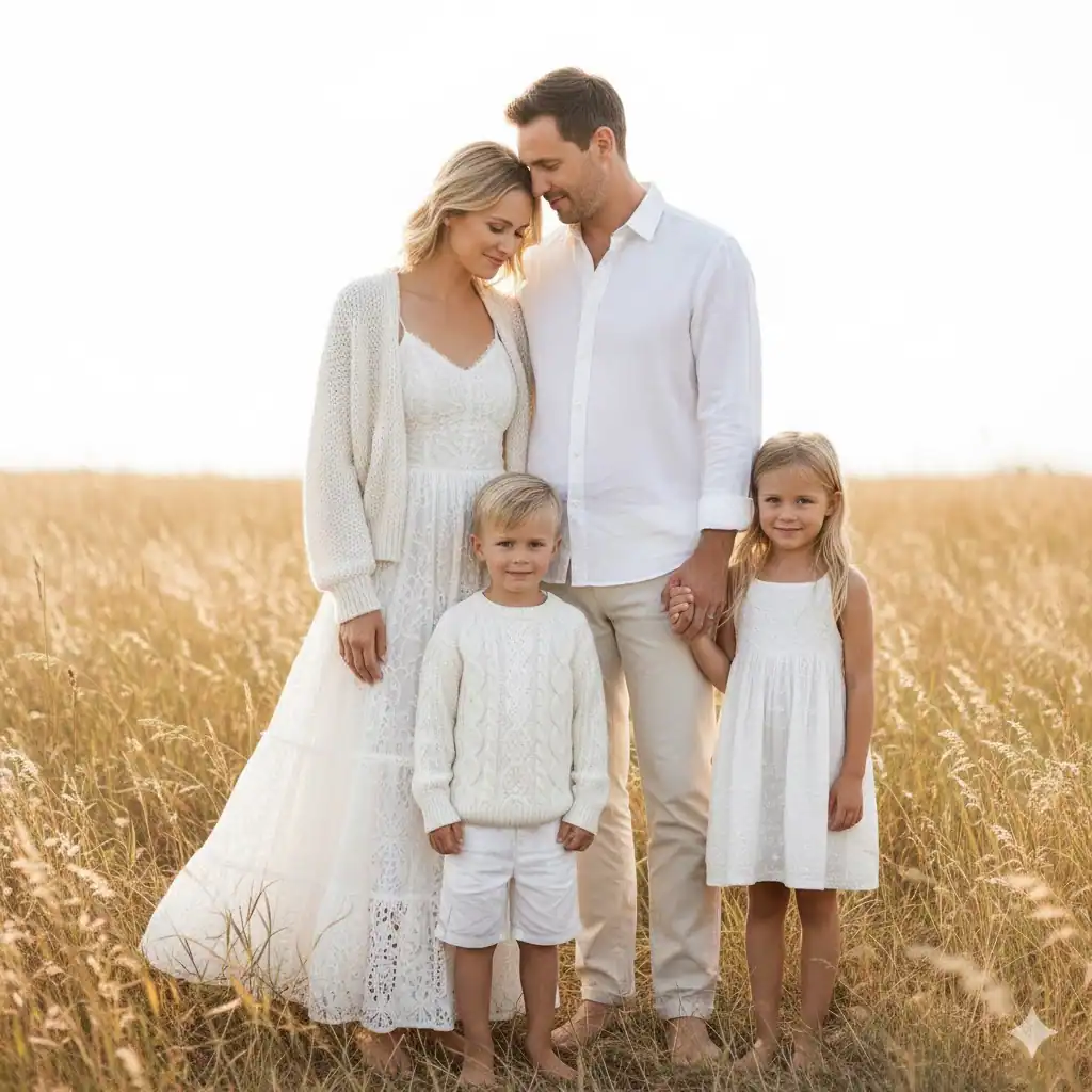
Okay, I know we said matching outfits can feel outdated — but an all-white outfit theme can look stunning if you mix prints, fabrics, and styles. The key is ensuring every piece has texture.
Think: linen, lace, cotton, or knit.
Not: shiny, stiff, plasticky fabric that reflects light weirdly.
When done right, this look feels clean, fresh, and angelic — especially in outdoor light.
9. Jewel Tones for Bold, Rich Photos
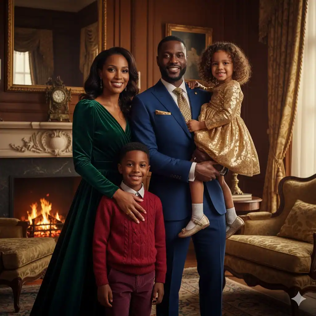
If you want something dramatic and vibrant (but not chaotic), jewel tones are gorgeous. Deep emerald, sapphire blue, ruby red, plum, and gold look rich and luxurious in portraits.
These colors work especially well for studio, winter, or holiday portraits.
You’ll look like the classy, coordinated family who drinks hot cocoa by a fireplace (even if you definitely don’t sit still together for more than 3 minutes).
10. Dress for the Location
The biggest mistake I see? Choosing outfits without thinking about the photo background. The location plays a massive role in how your colors show up on camera.
General rule:
- Outdoors = soft, natural tones
- Indoors = warm, cozy neutrals
- Beach = light, airy colors
- Studio = bold or refined tones work great
Ask: “Do we blend with the background or fight it?” Blending wins every time.
11. Monochromatic Outfits (Different Shades of the Same Color)
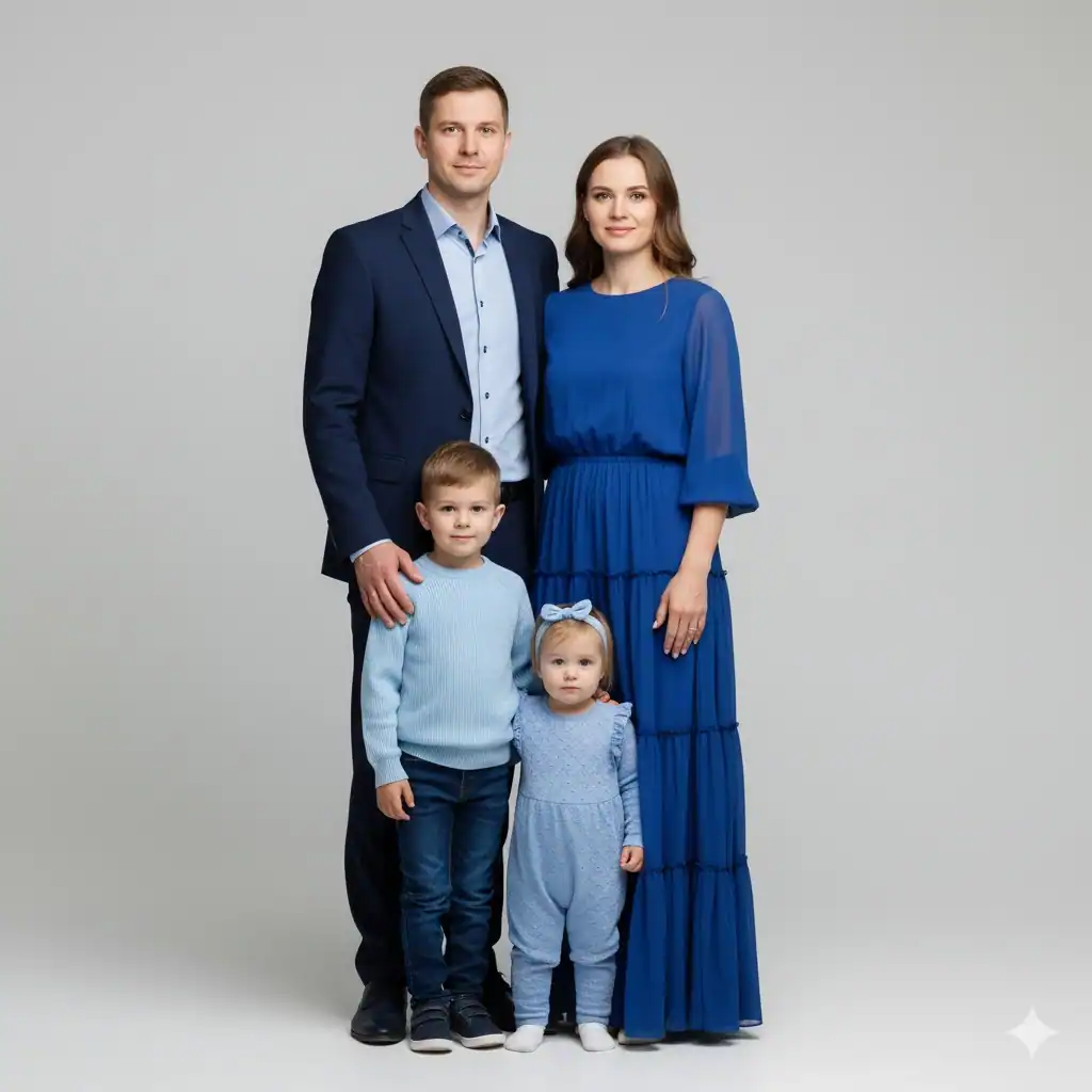
This is one of my favorites. Choose one color, then have each family member wear different shades of that color. It looks modern, simple, and visually calming.
Example palette: All wearing blues
- Navy
- Dusty blue
- Baby blue
- Steel gray-blue
It looks intentional without needing too much planning — which is always a plus.
12. Soft Florals + Solid Basics
If you want a slightly romantic or boho feel, put one person (usually mom or daughter) in a soft floral dress, then build the rest of the outfits around the colors in that dress.
This style works beautifully in gardens, nature trails, or outdoor fields.
Avoid loud florals, though — remember, we’re going for soft beauty, not tropical Hawaiian vacation conference vibes :/
13. Include Layers to Add Depth
Layers make photos more visually interesting. They also help give portraits that organic, lifestyle feel. Things like cardigans, denim jackets, shawls, scarves, and vests add dimension and movement to photos.
Bonus: layers help with temperature weirdness (and we all know someone is always too cold or too hot).
14. Choose Comfortable Fabrics
I promise — if someone is uncomfortable, it shows. Avoid itchy sweaters, stiff dresses, scratchy lace, or outfits that require constant adjusting. Comfort makes natural smiles happen. And natural smiles? They’re the real goal.
IMO, this tip is just as important as color coordination.
15. Add One Small Matching Element to Tie Everyone Together
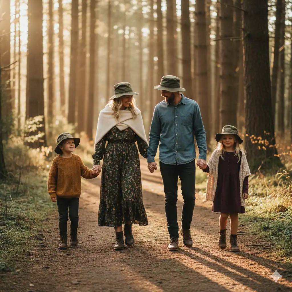
This could be:
- Matching shoe tones
- Matching accessories (like hats or scarves)
- Matching denim shades
- A shared color in each look
It’s a small detail with a big effect, bringing unity to the picture without making outfits look identical.
Final Tips for Stress-Free Family Portrait Outfits
Plan early so you’re not panicking on photo day.
Lay outfits out together to check the overall color balance.
Avoid bright neon colors (they reflect badly on skin).
Keep logos and large graphics out of the picture.
The goal is to make sure you shine — not the shirts.
Conclusion
Family portraits capture such special moments — whether you’re wrangling toddlers, laughing with teens, or hugging your whole crew close. Wearing outfits that feel coordinated, comfortable, and true to your family’s personality makes those photos feel even more meaningful.
You don’t need to be a stylist, and you definitely don’t need to stress yourself out trying to be perfect. Just follow these 15 family portrait outfit ideas, choose colors you love, and trust that your real smiles and real connections are what make every photo beautiful.
And hey — if someone still shows up wearing something unexpected… well, at least it’ll make a great memory later. 🙂